Data Guide
Navigating the world of data requires a grasp of its three pivotal stages: collection, processing, and presentation. Our guide offers a concise overview, taking you from gathering raw data to refining and presenting it in a comprehensible manner. Ideal for both beginners and seasoned practitioners, this guide sharpens your understanding of effective data management.
Data Collection
For every experiment you conduct, record the data in a dedicated row.
Ensure that the organization of your raw data remains simple. This will facilitate smoother processing later on.
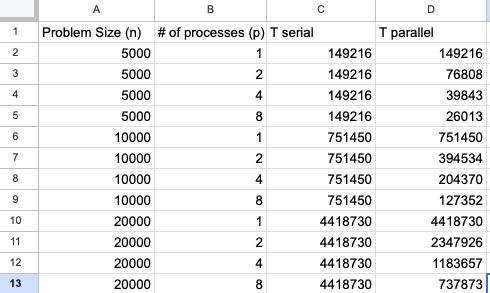
Sample screenshot of raw data
Data Processing
- Derived Fields:
After collecting your data, and before moving on to pivot tables, you might need to generate additional fields (columns). This is especially useful when you want to perform computations based on the existing data fields.
For instance, if you have columns “Price” and “Quantity”, you can derive a new field “Total” by multiplying these two.
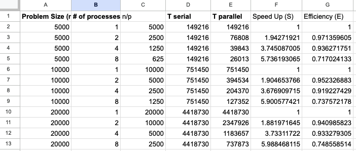
Sample screenshot of added derived fields computed from raw data. The “Speed Up” field is calculated by dividing the “Serial Time” by the “Parallel Time”.
Generating Views with Pivot Tables
Use pivot tables to generate a structured view of your data.
The generated tables are ready for plotting and analysis.
- Organize your pivot table in the following manner:
Rows: Contains the variables you want to study. It will be the X-axis in your plot.
Columns: This is where you separate out the different conditions or variations of your experiment. It will be the series in your plot.
Cell Data: These are the results or observations from your experiment. They will be the Y-axis in your plot.
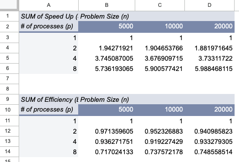
Sample screenshot of a pivot table.
Plotting Your Data:
In the typical plot generation process in software like Google Sheets, Microsoft Excel, etc:
X-axis: Rows in the pivot table.
Y-axis: Columns in the pivot table.
Legend: Represents the different series in the plot.
With the structured data format (as mentioned in the pivot table section), several tools can be utilized to visualize the results:
Google Sheets: Offers native support for creating various types of charts and plots.
Microsoft Excel: Provides a wide range of chart types for data.
Python Libraries:
Matplotlib: A basic, yet powerful, plotting library.
Seaborn: Built on top of Matplotlib, it provides a higher-level interface for drawing attractive and informative statistical graphics.
Pandas: Primarily a data manipulation library, but has plotting capabilities built on Matplotlib.
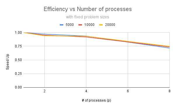
Sample plots from Google Sheets on the efficiency of parallel algorithms for different input sizes and number of processors.
Warning
Never make your numerical data employed as strings in your plots. It will make the axis out of scale. For example, if you have a column of numbers, and you want to plot them, you should first convert them to numbers. Otherwise, the plot will be wrong.
Key Takeaways
Keep your raw data structure simple and organized.
Don’t hesitate to derive new fields from existing data, especially if they provide new insights or simplify further processing.
Pivot tables are invaluable tools for creating structured data views, making data visualization significantly easier.
Multiple tools are available for data visualization; choose the one that best fits your needs.